
Psychologically, humans find it easier to read images and interpret them. A pictograph is a similar means where data is recorded in form of images and these images help us to understand statistical information in a much easier way. A pictograph is also known as a pictogram, pictorial chart, picture graph, and many more.
What Is A Pictograph?
A pictograph is a record consisting of pictorial symbols. Usually, in math, this is represented by the means of a graph or chart with symbolic figures representing a certain number of people, cars, factories, etc. This is one of the simplest ways to represent statistical data.
Advantages Of Using A Pictograph
The advantages of pictograph are as follows:
- Help kids to associate objects with numbers.
- They help in visually formatting statistics.
- A Pictograph makes data interesting and easy to understand.
- It is useful for representing a large amount of data.
Example of a Typical Pictograph
The manager of a Coffee Shop does a survey to find out what people think of all the sandwiches she sells. She interviews 12 regular customers asks them which sandwich is their favourite. She starts making a pictogram:
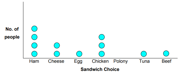
From the above example, we can make out that:
- Ham Sandwich is the most popular sandwich.
- Polony Sandwich is the least popular sandwich.
Hence, a pictograph helps us to interpret the data easily.
How To Make A Pictograph?
Below is a step-wise guide of making a pictograph.
- Gather Statistics: Before forming a pictograph, one must have the data on which the pictograph will be based on. You can easily find data in your textbook, or through a survey result.
- Choose Your Pictorial Symbol: The symbol can be anything, you can make it related to your data or you can choose shapes that are easy to draw.
- Must Give A Key: It is crucial to give a key in any form of data representation to inform the viewers about the unit you are showing the information about. One symbol might portray 1 unit or even 1000 units!
- Draw The Pictograph: Simply form an x-axis and a y-axis. Don’t forget to label them! You can now start adding the symbols according to the statistics.
- Revise: Revise and analyze your pictograph for any errors.
Tips
- All the symbols must be of the same size.
- A part of a symbol can also be used to show data.
Solved Questions Of Pictograph
Now that we are familiar with the pictograph, let’s work on some questions!
Q. 1. The pictograph shows the amount of money raised by students of different tutor groups for a school event. Read the pictograph carefully and answer the questions that follow:
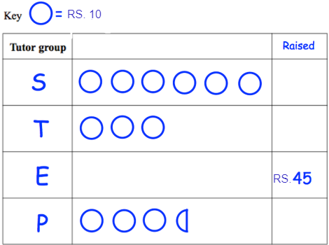
- Complete the raised column.
- Complete the pictogram for tutor group E.
- How much money was raised altogether?
A) As the key reads 1 circle = Rs. 10
- The Raised Column will be as such:
- Tutor Group S raised Rs. 60
- Tutor Group T raised Rs. 30
- Tutor Group E raised Rs. 45
- Tutor Group P raised Rs. 35
- The pictogram for tutor group E will have four complete circles and one half-circle representing Rs. 45.
- Total money raised by all the groups is: Rs. 60 + Rs. 30 + Rs. 45 + Rs. 35 = Rs. 170
Q. 2. The given pictograph shows the number of books of each category present in a local library. Read and interpret the pictograph carefully and answer the questions that follow:
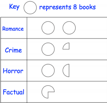
- How many romance books does the library have?
- What number of horror books does the library have?
- How many books in total does the library have? (Hint: Half circle = 4 books, Quarter circle = 2 books)
A) According to the key given, the answer to the above mentioned questions are as follows:
- The library has 16 romance books.
- The library has 12 books in the category of horror.
- Total books in the library are 44.
Q. 3. The number of hours of sunshine on a day, across a number of cities, is shown below. Read and interpret the pictograph carefully and answer the questions that follow: (Caution: The data is imaginative)
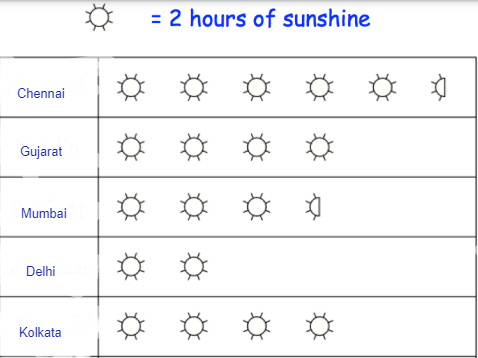
- How many more hours of sunshine was there in Chennai than in Mumbai?
- Ahmedabad had 9 hours of sunshine. Add a row of pictograph for Ahmedabad.
A) According to the key, the answers to above questions are:
- Chennai received 4 hours more sunshine than Mumbai.
- The pictograph ow of Ahmedabad will have 4 full suns and 1 half sun representing 9 hours of sunshine.
Q. 4. The data given below shows the number of different fruit trees on a farm. Draw a pictograph for it and answer the questions that follow:
| Name Of Fruit Tree | Number Of Trees |
| Apple | 18 |
| Guava | 30 |
| Peach | 24 |
| Pear | 12 |
- What number of peach trees are there on the farm?
- How many fewer pear trees are there than the peach trees?
- How many more guava trees are there than the apple trees?
A) First and foremost, it is important to assign a key. As we can see from the above data, all the trees are a multiple of 6. Hence we can take our key: 1 Symbol = 6 Trees. Let’s take our symbol to be a tree. The pictograph formed is shown:
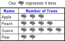
According to the pictograph, the answer to the questions are:
- Farm has a total of 24 peach trees.
- There are 12 less pear trees than farm trees.
- There are 12 more guava trees than apple trees.
Q. 5. The following pictograph shows information about the modes of transport used by students to commute to school. Answer the following questions based on the information given:
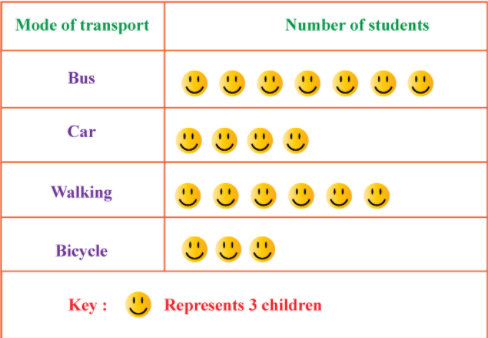
- How many students commute by car?
- Which is the most commonly used mode of transport?
- Which is the least preferred mode to reach school?
A) According to the key, the answer to the questions are as follows:
- 12 students travel by car.
- The bus is the most commonly used transport.
- A bicycle is the least preferred mode of transport to travel to school.
Also Read : How to calculate SGPA
Homework Question
Below you can find a challenging question of a pictograph! We have practiced enough and hopefully you will be able to solve it! All the best!
Q. A milkshake shop is trying to find out whether their chocolate or strawberry milkshakes are more popular. One day, they asked 10 regular customers to rate these two milkshakes on a scale of 1 to 10. 10 being delicious. Draw a pictograph and answer the questions that follow.
Here is the data:
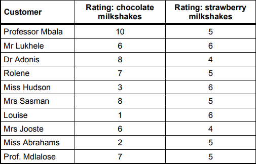
- Which kind of milkshake does Rolene prefer?
- Which kind of milkshake does Mr. Lukhele prefer?
Conclusion: Pictograph
Any data can be easily represented using pictures. To solve more problems and for various detailed and easy NCERT Solutions and CBSE Notes and Comprehensive Summary, browse StudyEquation!